🧮 Feynman Diagrams — Reality, sketched into interactions
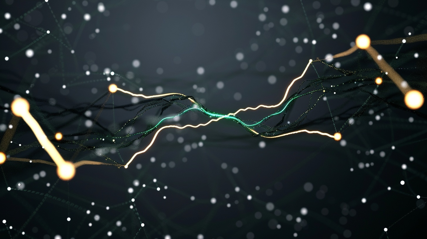
Particles, reduced to lines that meet and part.
🧠 UX Interpretation: Complexity translated into symbols
Feynman diagrams represent particle interactions using simple visual elements. Lines trace the paths of particles. Points show where they interact.
The diagrams do not show what happens in a literal sense. They encode relationships.
Physicists use them to calculate probabilities and understand behaviour at a scale that cannot be seen.
The model turns abstract mathematics into something drawable.
🎯 Theme: Abstraction as a working language
The strength of the diagram lies in its simplicity. Complex interactions become combinations of basic elements.
The user learns the grammar. A line bends. A vertex appears. Meaning follows.
This is not a picture of reality. It is a tool for thinking about reality.
The diagram works because it ignores almost everything and focuses on what matters for the calculation.
Understanding comes from learning the rules of the system.
💡 UX Takeaways
- Symbolic systems can make abstract domains workable.
- Simple visual rules can encode deep complexity.
- Learning a model often means learning its language.
- Effective models prioritise relationships over detail.
- Clarity emerges from disciplined reduction.
📎 Footnote
Feynman diagrams were developed by physicist Richard Feynman in the 1940s as a way to visualise and calculate interactions in quantum electrodynamics. They remain widely used in particle physics.