🗺️ Ordnance Survey Maps — The ground, measured into certainty
Every field, every wall, every contour — named, drawn, and fixed in place.
🧠 UX Interpretation: Precision builds trust
Ordnance Survey maps emerged from military need in the late 18th century. Britain was surveyed, triangulated, and recorded with extraordinary care.
Every feature found its place. Paths, hedgerows, churches, boundaries. Nothing was too small to include.
The result is a map that feels dependable. You can walk with it. You can rely on it.
The detail is not decorative. It is functional. It reduces uncertainty step by step.
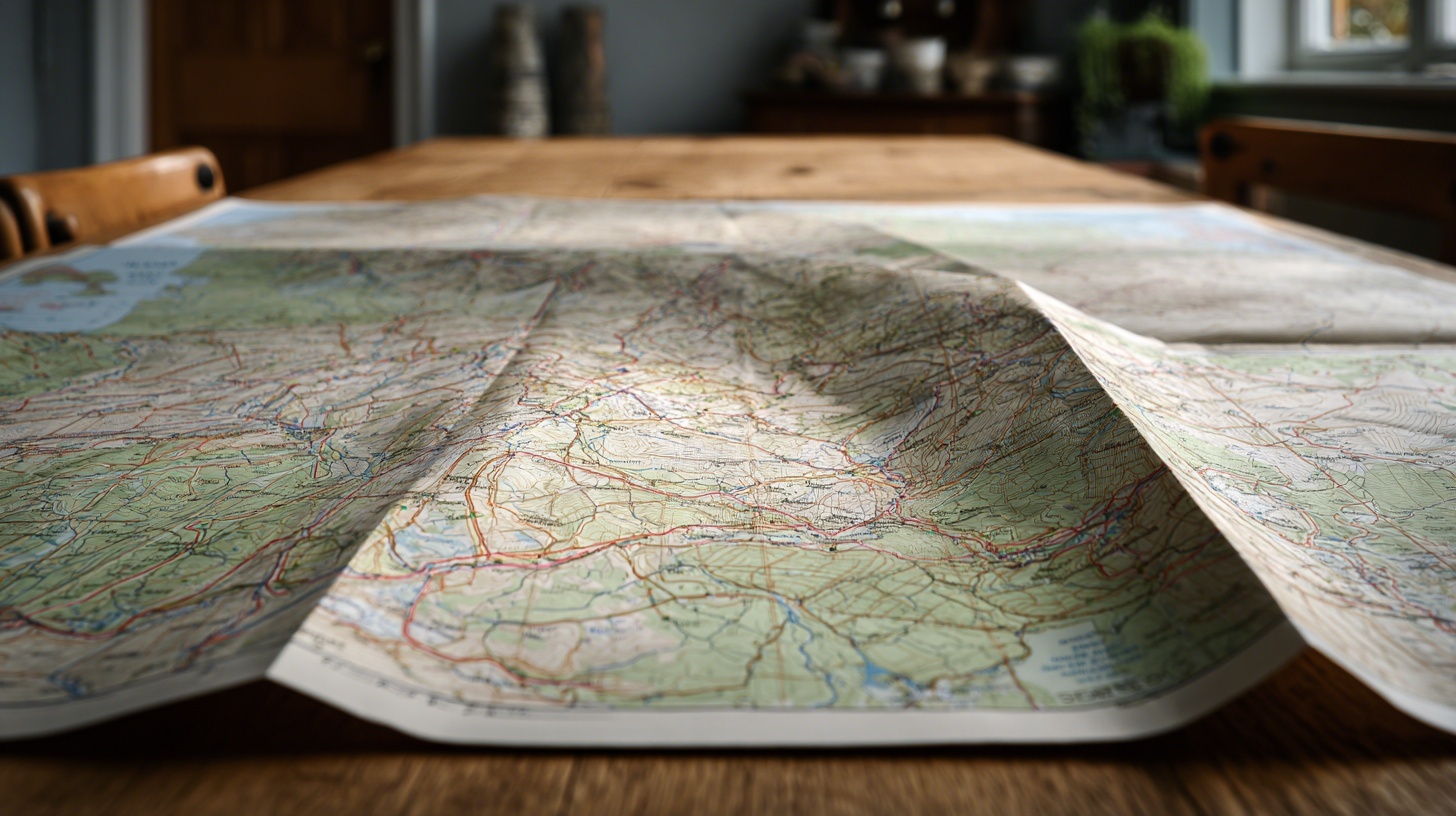
🎯 Theme: Authority through detail
Contours show height. Symbols show meaning. A language of marks replaces the landscape itself.
The user learns to read this language. A dashed line becomes a footpath. A cluster of shapes becomes a village.
The map does not simplify by removing. It simplifies by encoding.
This creates a quiet authority. The world appears measured, known, and stable.
Yet it is still a model. Time moves on. Paths shift. Buildings appear and disappear.
The map feels permanent. The land does not.
💡 UX Takeaways
- Detail increases confidence when it is structured.
- Symbols can compress complex reality into readable form.
- Consistency turns marks into a language.
- High fidelity can create an illusion of permanence.
- Even the most precise model ages over time.
📎 Footnote
The Ordnance Survey began as a military mapping project in Britain. Its detailed topographic maps are still widely used for walking, planning, and navigation, known for their accuracy and distinctive cartographic symbols.